Editing 3 - Portrait Series
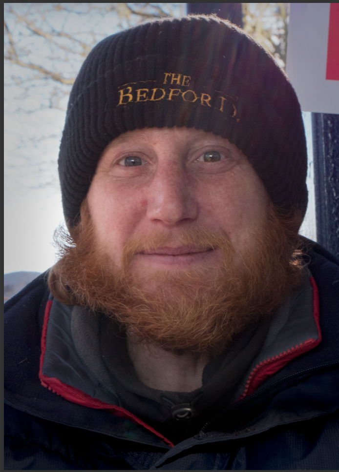
I started my edit with making the frame tighter to the subjects face by cropping the image.
I used colour balance to correct the colour slightly as I wanted the image to be similar in style to the other two images. I also brightened the image as it was rather dark.
I then used a black and white layer and changed the blend mode to Multiply to bring out the little details and tones.
As the image was already very dark, I brighten it up using a camera raw filter. I then brightened the eyes up more as I wanted the focus to be his eyes. I used a combination of the black and white layer adjustment, curves layer adjustment and gradient map layer adjustment to try and bring out more of the darker details.
I brightened the image again and used colour balance to add some warmth back into the image.
I decided then that I wanted to play about with the colour warmth and looked at my other images style and they looked cold. I used colour balance to change the colour to make them colder.
I wasn't happy with the darkness of the image so yet again I brightened the image. I changed the colour of the jacket red strip to blue to match the colour tent the man would be positioned under for the exhibition as I wanted there to be a correlation with both images. I also used the colour balance to bring out the orange more in the mans beard as I liked the complimentary colours of the blue and orange together.
I used the dodge and burn tools to bring out the highlights and darken the shadows more using a grey layer and the overlay layer blend mode and then put the image into the camera raw filter and played with the shadows and highlights and colour of the image.
I tried to correct the magenta colour within the image as the skin looked too purple by using colour balance but this wasn't as effective as I would have liked it to have been and tried an alternative approach.
I put the image against the other two images already edited and decided that the skin colours were off and didn't match the other two and copied the colour into the skin onto this image, I did the same method with the colour of the beard too.
Now happy with the colour of the skin, I put the image again next to the other two images and decided something still wasn't right. I liked the darkness behind the man as the other two images have dark backgrounds however it looked faked and I didn't want that, even if it went against the style of the other two images.
I looked again at the tent image I created and saw the lights were on behind the blue tent and thought about how it would make sense to have the background lighter as it linked better to that specific part of the image. I took the blues out of the image and added more warmth again which I found worked better. I also used the same Gaussian blur method as I did with edit 2 so that the face was in focus.


Comments
Post a Comment